
Why your website gets traffic but no enquiries
Four hundred visitors, two enquiries, and one of those was a sales email. Here is the diagnostic sequence we run to find where a small business website is losing people.
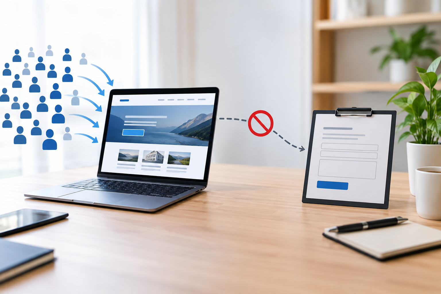
The analytics say four hundred people visited your website last month. The inbox says two of them got in touch, and one of those was somebody selling search engine optimisation. Something between those two numbers is broken, and from where you are sitting it is almost impossible to tell what.
This is the most common problem small businesses bring to us, and it is the one most often misdiagnosed. The obvious answer is usually the wrong one. Owners assume they need more traffic. Agencies, being agencies, are happy to sell more traffic. Quite often the site was already receiving enough visitors to produce a respectable number of enquiries, and those visitors were leaving for reasons that had nothing whatsoever to do with how many of them there were.
What follows is the diagnostic sequence we run before quoting on any project of this kind. It is written so you can work through it yourself with nothing more than a phone, a browser and access to your own analytics. Some of it you can fix in an afternoon. Some of it needs a developer. All of it is worth checking before you spend another penny on advertising.
Traffic problem, conversion problem, or tracking problem
Before you change anything, establish which of the three you have. They look identical from the inbox and they need completely different fixes.
Take last month. Find the number of sessions on your site. Find the number of enquiries you actually received by every route, including the form, the phone, direct email, WhatsApp and messages on social. Divide the second number by the first and you have a conversion rate.
Do it honestly. Count the enquiry from the person who rang because they saw your van. Exclude the three messages from your supplier. The number only helps if it describes what the website did.
What a healthy number looks like
For a small service business with a site that is doing its job, somewhere between one and three enquiries per hundred visitors is normal. Local trades and professional services receiving strong intent traffic often run higher, sometimes five or six per hundred. Ecommerce is a different calculation and a first time purchase rate of one to two per hundred is ordinary.
These are bands, not targets. The purpose of the exercise is not to hit a benchmark set by somebody else's business. It is to tell you which end of the funnel deserves your attention.
Reading the result
- Under half a percent, with traffic that looks reasonable. You have a conversion problem. Visitors are arriving and the site is losing them. Buying more traffic will simply lose more people, faster, at greater expense.
- A respectable rate, but very little traffic. You have a traffic problem. The site is working. Not enough people are seeing it. This is where search and paid media earn their keep, because you already know the visitors convert when they arrive.
- Zero for months, with traffic that looks fine. Suspect the tracking before you suspect anything else. A form that has quietly stopped sending is far more common than most people believe, and it produces exactly this pattern.
The number that lies to you
Raw session counts flatter almost every small site. A meaningful share of what appears in your analytics is not a potential customer. Automated crawlers, scrapers, your own visits from the office, your web developer checking something, referral spam from domains you have never heard of. None of those people were ever going to contact you.
Segment by channel before you draw conclusions. Organic search, direct, paid, social and referral behave differently and convert at wildly different rates. An average that blends a high intent search visitor with somebody who bounced off an Instagram story after two seconds describes nobody. If a single channel is dragging the average down, that is useful information rather than a verdict on your website.
The page does not answer the question the visitor arrived with
Every visitor arrives carrying a question. Somebody searching for emergency boiler repair in Leeds is asking whether you can come today. Somebody searching for kitchen extension cost is asking for a number. Somebody who clicked an advert for accountancy for limited companies is asking whether you handle businesses like theirs.
The page they land on either answers that question in the first screen or it does not. When it does not, they return to the results and click the next listing. This takes about four seconds and leaves no trace beyond a bounce.
The most frequent version of this failure is sending everybody to the homepage. A homepage has to serve every audience at once, which means it serves each of them weakly. Somebody who searched for one specific service arrives at a page describing eleven services and has to start hunting. Most will not bother.
How to check it
Open your search performance report and list the ten queries bringing you the most clicks. For each one, open the page that ranks for it and read only what is visible before you scroll. Ask whether a stranger would find their answer there.
Do this on a phone, not a laptop. What sits above the fold on a desktop monitor can be three scrolls down on a handset, and the majority of small business traffic is now mobile.
What fixes it
Give each significant service its own page, written for the question that service answers. Not a paragraph on a combined page. A page, with its own heading, its own proof, its own call to action and its own place in your navigation.
This is slower than it sounds and it is usually the single highest value change available to a small business site. It improves conversion because the page finally matches the intent. It improves rankings for the same reason. If you are already running advertising, a dedicated landing page per campaign does the same job for paid traffic.
Nobody can tell what you do in the first five seconds
Sit somebody who has never seen your website in front of it. Let them look for five seconds, then cover the screen and ask them three questions. What does this company do. Who is it for. What would you do next if you were interested.
The failure rate on this test is extraordinary, and it is almost always the wording rather than the design. Headlines that describe an attitude instead of a service are the usual culprit. Delivering excellence since 2011. Your partner in growth. Innovative solutions for the modern business. Every one of those sentences could sit on the website of a dental practice, a logistics firm or a software company without changing a word.
If your headline would still make sense on a competitor's website, it is not a headline. It is decoration.
The fix is unglamorous. State what you do, who you do it for, and where. Commercial electrical contractors for retail and hospitality sites across Yorkshire tells a visitor more in eleven words than three paragraphs of positioning language.
Then make the visual hierarchy agree with the wording. If the largest thing on the screen is a stock photograph of a handshake and the smallest is the sentence explaining your service, the page is emphasising the wrong thing regardless of how carefully that sentence was written.
The words people actually use
Write in the vocabulary your customers use, not the vocabulary of your industry. People search for man and van, not domestic relocation services. They search for damp problem, not rising damp remediation. Internal language creeps into websites because everyone in the building speaks it daily and nobody notices any more.
Your own enquiry emails are the best source of correct vocabulary you have. Read the last twenty and note the words customers use to describe what they need. Those are the words that belong on your pages.
The site is slow on the phones your customers actually use
Speed is not a technical nicety. It is a conversion input, and on mobile it is frequently the largest one. A visitor who taps a result and watches a blank screen for four seconds has not formed an opinion about your business. They have gone back and chosen a competitor.
Google measures this through three field metrics gathered from real Chrome users rather than from a laboratory test. Largest Contentful Paint should be under 2.5 seconds. Interaction to Next Paint, which measures how quickly the page responds when somebody taps something, should be under 200 milliseconds. Cumulative Layout Shift, which measures how much the page jumps around while loading, should be under 0.1. You pass a metric when at least seventy five percent of real visits meet the threshold.
The detail that catches people out is the words real visits. A perfect score in a testing tool on a fast office connection means very little if a quarter of your visitors are on mid range handsets on patchy mobile data. We go into this in more depth in the Core Web Vitals work that actually moves rankings.
What is usually slowing a small business site
- Uncompressed images. A hero photograph exported straight from a camera or a stock library at four thousand pixels wide, scaled down in the browser rather than on the server. This is the most common single cause and the easiest to fix.
- Plugin accumulation. Every plugin added over five years is still loading its stylesheet and its script on every page, including the ones added for a campaign that ended in 2022.
- Page builders. Convenient to edit, heavy to load, and frequently generating far more markup than the page needs.
- Third party scripts. Chat widgets, review badges, heat mapping, three analytics tools and a cookie banner, each one blocking the main thread while the visitor waits.
- Cheap shared hosting. The server takes most of a second to begin responding, before a single image has been requested. No amount of front end optimisation recovers that.
Run your busiest pages through a field data report rather than a single laboratory test, and fix whichever metric sits furthest into the poor band first. If your platform keeps failing no matter how many optimisation plugins get added, the honest answer is often that the theme is the problem, which is a build question rather than a plugin question.
There is no obvious next step
A visitor who is persuaded still needs to be told what to do. A surprising number of small business pages simply stop. The service is described, the benefits are listed, the page ends, and the visitor is left to work out for themselves that they should scroll back up and find the contact link.
Most will not. Persuasion has a half life measured in seconds, and the moment a visitor has to think about how to proceed, some proportion of them leaves.
One page, one primary action
Decide what a single page is for and make that action visually dominant. A service page exists to produce an enquiry. That means the button that produces an enquiry should be the most prominent element on the page, repeated at sensible intervals, and phrased as something a person would want.
Submit is not something anybody wants. Learn more commits to nothing. Get a fixed quote, book a fifteen minute call, check availability for your date, see the full price list: each of those describes a thing the visitor receives, and each performs better than a generic instruction.
Competing actions dilute this. When a page offers a newsletter signup, a brochure download, a chat widget, a phone number, a contact form and a link to your Instagram, all with equal weight, it has offered nothing. Pick the one that matters and let it lead.
Placement
Include a call to action near the top for people who arrived already convinced, and again after each substantial section for people who needed convincing. On mobile, a persistent call or enquire bar fixed to the bottom of the screen consistently outperforms a button the visitor has to scroll to find. For a business that takes bookings by phone, this alone can move the number noticeably.
The form asks for too much, too early
Every field on a form is a small request. Some are reasonable. Some are not, given how little the visitor knows about you yet. Fields that feel intrusive at this stage do not get completed thoughtfully. They get the form abandoned.
The pattern we see most often is a form built around what the business would like to know rather than what is needed to start a conversation. Full name, company name, job title, phone number, budget range, timescale, how did you hear about us, and a message box. Nine fields to ask a question.
What to remove
- Anything you could ask in the reply. If the answer is not needed to decide whether to respond, it does not belong on the first form.
- A required phone number. This suppresses completions more than almost any other single field, because a number implies being rung. Offer it as optional and watch the rate move.
- Budget dropdowns. Visitors who have no idea what things cost cannot answer and will not guess. Publish your ranges instead and let them self select.
- How did you hear about us. Attribution is a tracking job, not a customer's job.
Name, an email address and a message box is enough to begin almost any conversation. If your business genuinely needs more detail to quote, split the form into two steps and ask for the contact details first. A partially completed multi step form still tells you somebody was interested, which a single abandoned page does not.
The parts nobody tests
Validation messages that appear only at the top of a long form on mobile, so the visitor taps submit, sees nothing change and concludes the site is broken. Date pickers that fight the phone keyboard. A reCAPTCHA challenge that quietly rejects real people. A thank you page that never appears, leaving the visitor wondering whether the message went anywhere.
Test your own form from a phone on mobile data, not from the office wifi on the machine you built it on. Then do it again after every update to the site.
Nothing on the page makes you look safe to contact
Contacting a small business carries a risk the business rarely appreciates. The visitor is weighing up whether you will reply, whether you are still trading, whether you are one person or forty, and whether they are about to be pursued by a salesperson for a fortnight.
Most small sites fail to answer any of that, then wonder why visitors who read three pages never made contact.
The signals that matter
- Named humans with faces. Real photographs of the actual team, not a stock library. This matters more for small businesses than large ones, because the buyer is choosing a person.
- A physical location. Even if you work remotely, a town establishes that you exist somewhere. A site that hides its location reads as evasive.
- Proof with specifics. A testimonial attributed to J.S., Manchester carries almost no weight. A named person, their company and a concrete outcome carries a great deal.
- Work you have actually done. Photographs of your projects, your installations, your finished sites. A portfolio of real work answers questions that adjectives cannot.
- Recent activity. A copyright line reading 2021, a news section whose last entry was three years ago, or a blog with one post. Each suggests the business may not be running any more.
- Reviews where people look for them. Google reviews visible on the page and a healthy profile behind them.
Reduce the cost of contacting you
Say what happens next. We reply within one working day. No obligation and no follow up sequence. A fifteen minute call, and if we are not the right fit we will tell you who is. Sentences like these remove the unspoken fear that making contact starts something the visitor cannot stop, and they cost nothing to add.
The price question goes unanswered
Price is the first thing most buyers want to know and the last thing most small business websites are willing to discuss. The reasoning is familiar. Every job is different. We do not want to scare anybody off. We would rather have the conversation.
The trouble is that the visitor also wants to avoid a conversation until they know roughly where they stand. Faced with a site that will not indicate a range, a good proportion of them assume the answer is expensive and leave to find a site that will.
You do not have to publish a fixed price list. You have to stop pretending the question has not been asked. Starting figures, typical ranges for typical projects, worked examples of what a recent job cost and what it included, or a clear explanation of what makes a project sit at the higher end: any of these serve the purpose. Our own view on this is set out in what a web design agency should actually cost, and we publish our prices for the same reason.
What transparency actually does
It does not reduce enquiries. It changes who sends them. The people who were never going to proceed at your prices screen themselves out before they take up an hour of your time, and the people who do make contact arrive already comfortable with the order of magnitude. For a small team, that shift in enquiry quality is often worth more than the raw count.
It also handles a question you cannot see being asked. Nobody emails to ask whether you are affordable. They simply close the tab.
Mobile is treated as a smaller desktop
Most small business websites are still designed on a wide screen and checked on a phone at the end. The majority of visitors experience them the other way round, and the compromises made to fit a desktop layout onto a handset are where enquiries disappear.
The specific failures
- Tap targets too small or too close together. Links in a list with eight pixels between them, so the wrong one gets hit and the visitor gives up.
- A phone number that is not a link. On a handset, a number that cannot be tapped to dial is asking the visitor to memorise eleven digits and switch apps.
- Navigation hidden behind a menu icon with no obvious way to contact you. Two taps to reach a contact page is two taps too many for an urgent job.
- Text at twelve pixels. Legible on the monitor it was designed on, a squint on a phone in daylight.
- Layout that shifts while loading. The visitor taps a button, an image finishes loading above it, the page jumps and they have tapped something else. This is measured as Cumulative Layout Shift and it is deeply irritating to experience.
- Pop ups that cannot be closed on a small screen, where the dismiss icon sits just off the edge of the viewport.
None of this is exotic. All of it is found by picking up an ordinary phone, opening your own website as a stranger would, and trying to make an enquiry. Do it on a two year old handset rather than the newest one in the office, because that is closer to what your visitors are holding.
You rank for words that do not buy
Traffic is not one thing. A visitor searching how to unblock a sink and a visitor searching emergency plumber near me have almost nothing in common except the industry. The first wants to avoid paying anybody. The second is holding a phone above a flooded kitchen.
Plenty of small business sites have decent traffic composed almost entirely of the first kind. The blog ranks, the numbers look encouraging, and none of it converts, because the people arriving were never in the market.
Sorting your traffic by intent
Open your search performance report and sort your queries into three groups. Informational queries where somebody wants to learn something. Commercial queries where somebody is comparing options, usually containing words like best, versus, cost or review. Transactional queries where somebody is ready, usually containing a service and a place, or words like near me, hire, book or quote.
If almost all your clicks are informational, that explains the empty inbox on its own. Informational content has a role, but it is a long game and it needs a route from the article to the service. An article that answers a question and then simply ends has done half a job.
Where the buying queries live
For most small businesses they are service plus location. Emergency electrician Headingley. Wedding photographer West Yorkshire. Commercial cleaning Leeds city centre. These queries have modest search volume and very high intent, which is exactly the combination a small business wants and exactly the combination that gets overlooked in favour of a broad term the business will never rank for.
Build a real page for each meaningful service and location combination, with genuinely local content on it. Not the same page repeated with the place name swapped, which search engines identify easily and users find insulting. Actual projects in that area, actual coverage details, actual local knowledge.
If the buying queries in your market are genuinely competitive, that is a reasonable case for paid search while the organic work matures. Advertising buys you the position today. It does not build the asset. Run both and let the paid data tell you which keywords are worth the organic effort.
Local search is not set up properly
For any business serving a geographic area, a substantial share of enquiries never touches your website at all. They come through the map results, where the visitor reads reviews, checks the opening hours and taps call without ever visiting a page you designed.
This means your Google Business Profile is doing work your website cannot, and a neglected profile costs enquiries invisibly.
The parts that get neglected
- Categories. The primary category has more influence over which searches you appear in than almost anything else on the profile, and it is usually chosen once and never revisited.
- Service area and address. Vague or incorrect coverage keeps you out of results for places you genuinely serve.
- Consistent details everywhere. The same business name, address and phone number across your site, your profile and every directory listing. Three variations of your address across the internet muddies the signal.
- Photographs. Profiles with recent, real photographs get more interaction than those with a logo and nothing else.
- Reviews, and replies to reviews. Volume matters, recency matters, and a thoughtful reply to a critical review reassures future customers more than a flawless average does.
- Opening hours, kept accurate. Including bank holidays. Somebody who drives to a closed business rarely comes back.
Ask every satisfied customer for a review, by name, at the moment they are happiest. Most small businesses never ask at all, then conclude that their customers do not leave reviews.
The enquiries arrive and you never see them
This sounds far fetched until it happens to you. We have audited sites where the form had been silently failing for eight months. The visitor saw a confirmation message. Nothing was sent. Nothing was stored. Several hundred enquiries went nowhere, and the owner spent that period concluding that their marketing did not work.
How it happens
- Email deliverability. The form sends from your own domain via the web server, the receiving provider treats it as forged, and it lands in spam or is rejected outright. Extremely common and rarely noticed.
- A notification address that no longer exists. The staff member who set it up has left and their mailbox was closed.
- A plugin update that broke the handler. The form still renders and still shows the success message. The submission goes nowhere.
- Anti spam that is too aggressive. Genuine enquiries silently classified and discarded.
- Nothing stored in the database. Email only, with no record, so a delivery failure is total and permanent.
What to do about it
Submit your own form once a month from a personal address on a phone, and check it arrives in the inbox rather than the junk folder. Store every submission in the database as well as emailing it, so a delivery problem is recoverable. Send an automatic acknowledgement to the enquirer, which both reassures them and tells you immediately when sending has broken.
The same category of failure affects measurement rather than delivery. If your analytics has never recorded a conversion, or the number it reports bears no relation to the number of emails in your inbox, the problem may be the configuration rather than the website. We wrote about the version of this that affects advertising accounts in the conversion tracking mistake in most ad accounts. Businesses have cut campaigns that were working because a tag was wrong, and it is worth ruling out before you make expensive decisions from the data.
You are invisible in AI search
A meaningful share of the questions that used to produce a click now produce an answer instead. Search engines summarise at the top of the page, and assistants answer directly. For informational queries in particular, the visitor gets what they needed without visiting anybody's website.
Small business sites feel this more than most, because a great deal of small business content is exactly the sort of straightforward question that summarises well. The traffic decline appears without anything on the site having changed.
The response is not to abandon search. It is to become one of the sources that gets cited, because the citation carries your name into the answer and the visitors who do click through are further along than they used to be. They have read the summary and want depth or want to hire somebody.
What makes a page quotable
- Direct answers near the top. State the answer in the first two sentences under the relevant heading, then explain it. Content that builds slowly to a conclusion is difficult to extract.
- Headings phrased as the questions people ask. A heading that matches the query gives the extraction something to anchor to.
- Specifics rather than generalities. Numbers, ranges, named processes, actual timescales. Vague reassurance is not quotable by anything.
- Structured data that matches the page. Organisation, local business, service and frequently asked question markup, describing what is genuinely on the page.
- Details a model cannot invent. Your coverage area, your response times, your process, your prices. First hand information is the part of your site that cannot be summarised from somewhere else.
There is more on this in writing pages that rank in Google and get cited by AI search. The short version is that the same work improves both, because both are trying to identify the page that answers the question most directly.
Fixing this in the right order
Thirteen possible causes is not an action plan. Work through them in an order that puts certainty before effort, so you are not rebuilding a website to solve a problem that turns out to be a broken form.
First, in an afternoon
- Submit your own enquiry form from a phone on mobile data and confirm it arrives. Do the same for every other form on the site.
- Calculate the conversion rate for last month and decide whether you have a traffic problem or a conversion problem.
- Open your five most visited pages on a phone and attempt to make an enquiry as a stranger would. Note every point where you hesitate.
- Check your Google Business Profile for the correct primary category, accurate hours and a reply to every review.
Next, over a fortnight
- Rewrite the first screen of your homepage and your three most important service pages so a stranger can state what you do, who for and where.
- Strip the enquiry form back to the fields you genuinely need, and add a sentence describing what happens after somebody submits it.
- Put a clear primary action on every page, repeated, phrased as something the visitor receives.
- Add a price indication, even a range, on every service page.
- Compress your images and remove the plugins and scripts nothing depends on.
Then, as a project
- Build a proper page for each significant service, and for each service and location combination that has genuine demand.
- Address the performance issues that survive the easy fixes, which frequently means the theme or the hosting rather than the content.
- Set up measurement properly, so the next time you ask this question you can answer it from data rather than from the inbox.
- Keep it maintained, because a site that is not updated degrades quietly. That is what a support arrangement is for.
Change things in batches you can attribute. If you rewrite every page, redesign the forms and launch an advertising campaign in the same week, you will have more enquiries and no idea which change produced them. That matters, because you will want to do the effective thing again.
When it is not the website at all
Sometimes the site is fine. It loads quickly, it says what the business does, the form works, the traffic has intent, and the enquiries still do not come. At that point the honest answer is that the problem sits outside the website, and no amount of design work will reach it.
The offer may be wrong for the market. You may be priced where nobody in that audience is buying, or selling something people want but not in the way it is packaged. A website presents an offer clearly. It cannot make a poor offer attractive, and a good site will simply help more people decide against you more efficiently.
The market may be too small. Some services have a few hundred buyers nationally, and search is the wrong channel entirely. Direct outreach, partnerships and industry networks will do more than any amount of on page work.
Or the enquiries exist and are being lost after arrival. If the average response time to a new enquiry is two days, a good proportion of those people have already hired somebody else. Speed of reply is not a website feature, and it converts more reliably than most things that are.
A competent agency should be willing to tell you this. If everything you describe points at your pricing rather than your homepage, the useful answer is to say so, even though the other answer is the one that comes with an invoice. That is the conversation worth having before you commission anything.
Frequently asked
For a small service business, one to three enquiries per hundred visitors is normal. Local trades and professional services with high intent traffic often run higher, around five or six per hundred. Ecommerce is different again, with one to two first time purchases per hundred visitors being ordinary.
Divide last month's enquiries by last month's sessions. A low rate on reasonable traffic is a conversion problem, and buying more traffic will make it more expensive rather than better. A healthy rate on very little traffic is a traffic problem, and that is when search and advertising are worth the money.
Usually email deliverability. The form sends from your own domain via the web server, the receiving provider treats the message as forged, and it is filed as spam or rejected. The visitor still sees a success message, so nothing looks wrong from either end. Submit your own form monthly from a personal address to catch it.
Want this handled for you?
We build and run the sites we write about. Tell us the target and we will scope it.
Start a project